Colours of Marketing – pink in marketing from Barbie to Victoria’s Secret
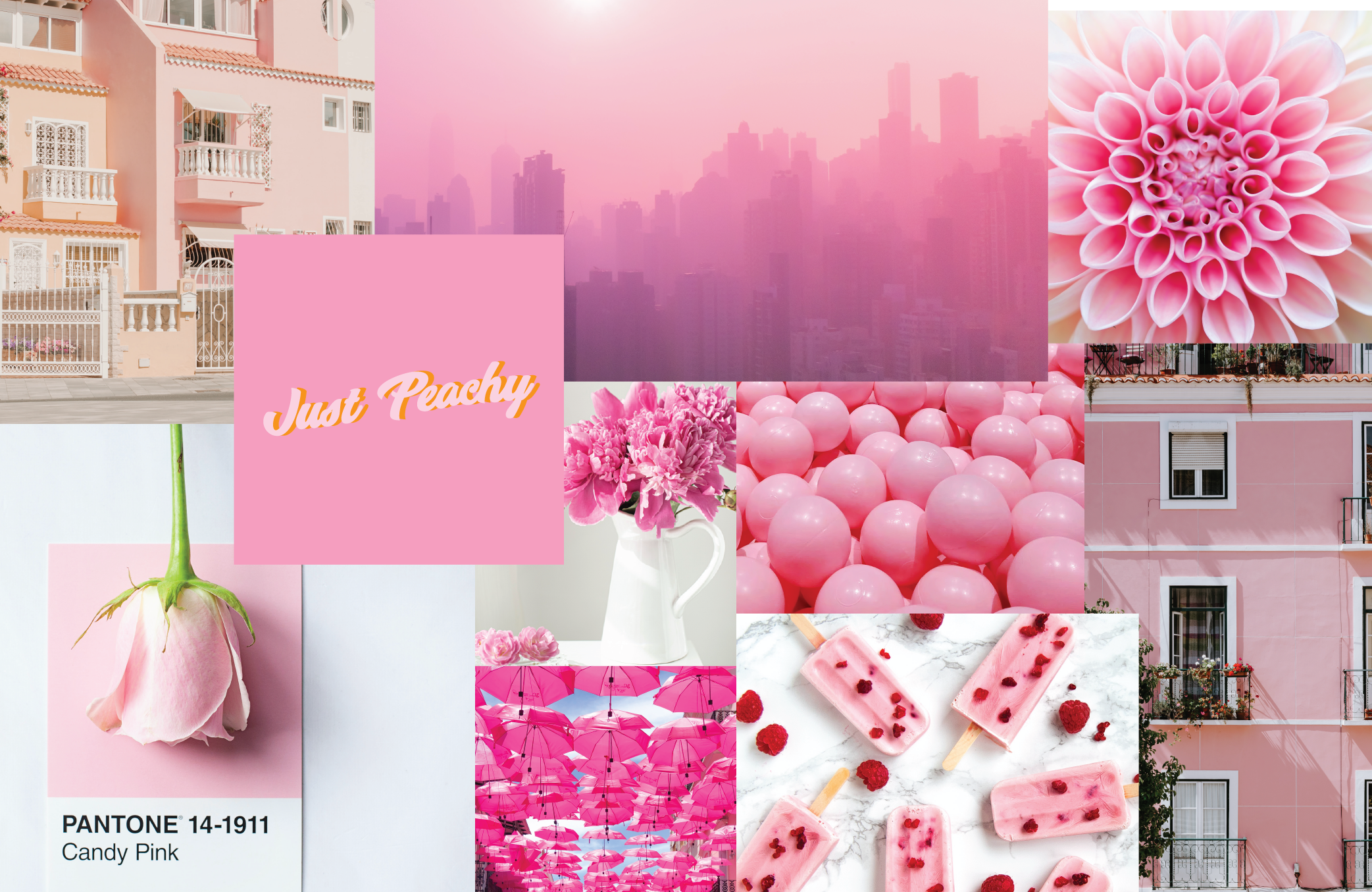
When it comes to the colour pink in marketing, shade matters! Research has shown that light pink invokes in people feelings of gentleness, calm, innocence, soothing and purity, while bright pink is trendy and vibrant with dark pink associated more with elegance and charm.
When you take a closer look at which organisations use pink in their branding, the reasoning behind the shade chosen says a great deal about the brand and the market they are targeting.
Branding Compass explains pink “has a strong connection with feminine brands”, a phenomena which starts with marketing, signage and toy packaging for baby girls and stands as “the primary indicator that something is intended for girls”.
“This continues into adulthood with pink logos and branding for Victoria’s Secret, Avon and Cosmopolitan magazine—these are all brands that primarily sell to women,” Branding Compass continues. “The MaryKay makeup line was an early pink-dominated brand.”
“Pink, and more specifically the pink ribbon, has become the symbol of the fight against breast cancer. There are multiple breast cancer research and support organizations that use the pink ribbon.
“Many brands have introduced pink-colored products to highlight their support of breast cancer survivors and to show their financial support of research.”
Adobe describes pink as inspiring “feelings of kindness and compassion” while also being playful, nurturing and nostalgic taking “people back to their childhoods”.
It’s all About the Shade of Pink
A lighter shade of pink was chosen by fundraising behemoth National Breast Cancer Foundation to suggest hope, multinational skincare and cosmetics company Avon representing femininity and online accommodation marketplace Airbnb perhaps evocative of comfort and safety.
Brighter, louder shades of pink are favoured by progressive brands which want to be seen as keeping pace with changes in society including ride share Lyft, electronics company LG and women’s magazine Cosmopolitan.
Barbie and Pink
One of the most easily recognisable and brightest shades of pink used internationally in marketing is Barbie’s signature colour which has been central to the branding phenomena that was the doll franchise since its release to the public in the late 1950s.
New Jersey-based design agency Fat Rabbit Creative said the Barbie logo, “when paired with a font that looks like a child’s handwriting, their logo conveys a sense of fun, whimsy, and childhood”.
Other Brands
Other famous brands to adopt shades of bright pink for their branding include donut chains Dunkin’ Donuts and Donut King and, ice cream maker Baskin Robbins.
Pink is definitely a colour which is not suitable for every product and every brand, but it is versatile and, when the right shade is used, can be extremely effective at reaching its target market.
Contact Us
Does your company’s logo represent your company effectively, reaching your target market with a clear message? If you would like to talk about your branding and marketing, get in touch with Strictlymarketing’s Managing Director, Bev Strickland on bstrickland@strictlymarketing.com.au or phone 0417 761 966.
Strictlymarketing is based in Brisbane and specialises in marketing retail property and marketing shopping centres. Our other services include retail media management, graphic design and branding services, digital content creation, retail photography and shopping centre events. If you would like more information get in touch.