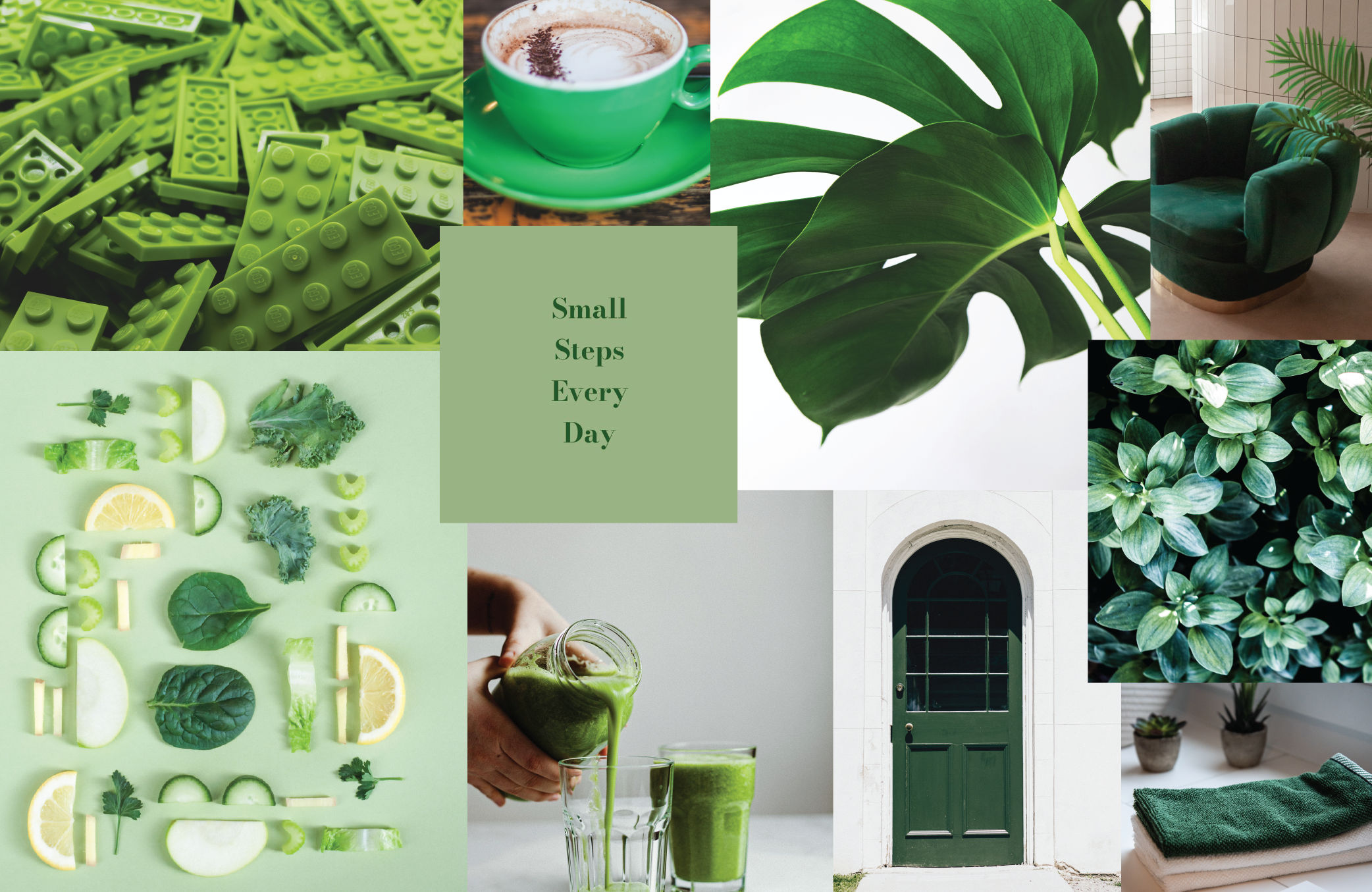
Colours of marketing – When green isn’t green
An organisation with a green logo may not necessarily be considered a “green company” while there are plenty of “green companies” with logos that don’t even feature green; a paradox you won’t find with any other colour.
While a lot could be written about eco-friendly, green companies, we are going to focus here on the colour green in marketing by brands as diverse as supermarket giants, beverage companies and even political parties.
Color Psychology’s (https://www.colorpsychology.org/green/) Cognitive Psychologist, Hailey van Braam, explains that green used in business symbolises money, transparency and prosperity, while it is considered to be a “trusted” colour which arouses feelings of security.
“Green is a dominant color in nature which represents natural and forestial environments,” van Braam says. “Out of all the colors on the colour wheel, green is regarded as the most restful and relaxing colour for the human eye.
“Green symbolizes harmony, tranquility, peace. As a soothing, relaxing color, it enhances stability and endurance. It is most often associated with growth and renewal, and it promotes optimism, hopefulness and balance.”
It is these final attributes, along with the implication of environmental friendliness, which makes green a compelling colour for branding by companies.
These include Woolworths, – what other colour would be in keeping with their slogan, “the fresh food people”? – The Green political party (what other colour would even be considered?), and adventure apparel retailer Kathmandu.
For the Australian Made logo, a gold kangaroo on a green background is an obvious choice, while organisations devoted to environmental causes such as Landcare Australia, Greenpeace and Animal Planet will always promote themselves using the colour green.
Service station chain BP is making a clear statement with its green logo that they sell petrol and care for the environment, while car brand Land Rover has stated it uses green in a nod to the ability of its vehicles “to get you out of the city and off paved roads” which are nowhere to be found in nature.
Interestingly green is used a lot by beverage companies such as Starbucks, Spring Valley, Heineken and Carlsberg, perhaps to represent the refreshing nature of its coffee, water, juice or beer.
And then there are the companies that use green, most likely, because it is just such a great colour. These include Spotify, Holiday Inn, 7 Eleven, Xbox, Tic Tac and Android.
The next time you see green used in a logo or branding, ask yourself these two questions: is it a green company or just a green logo and what are they trying to convey by using green? You may by surprised by the insights you discover.