Is it time for a logo refresh?
When is the last time you tweaked or refreshed your organisation’s logo? Amazingly, many businesses believe changing their logo is a strategically poor move because it disenfranchises the current customer base.
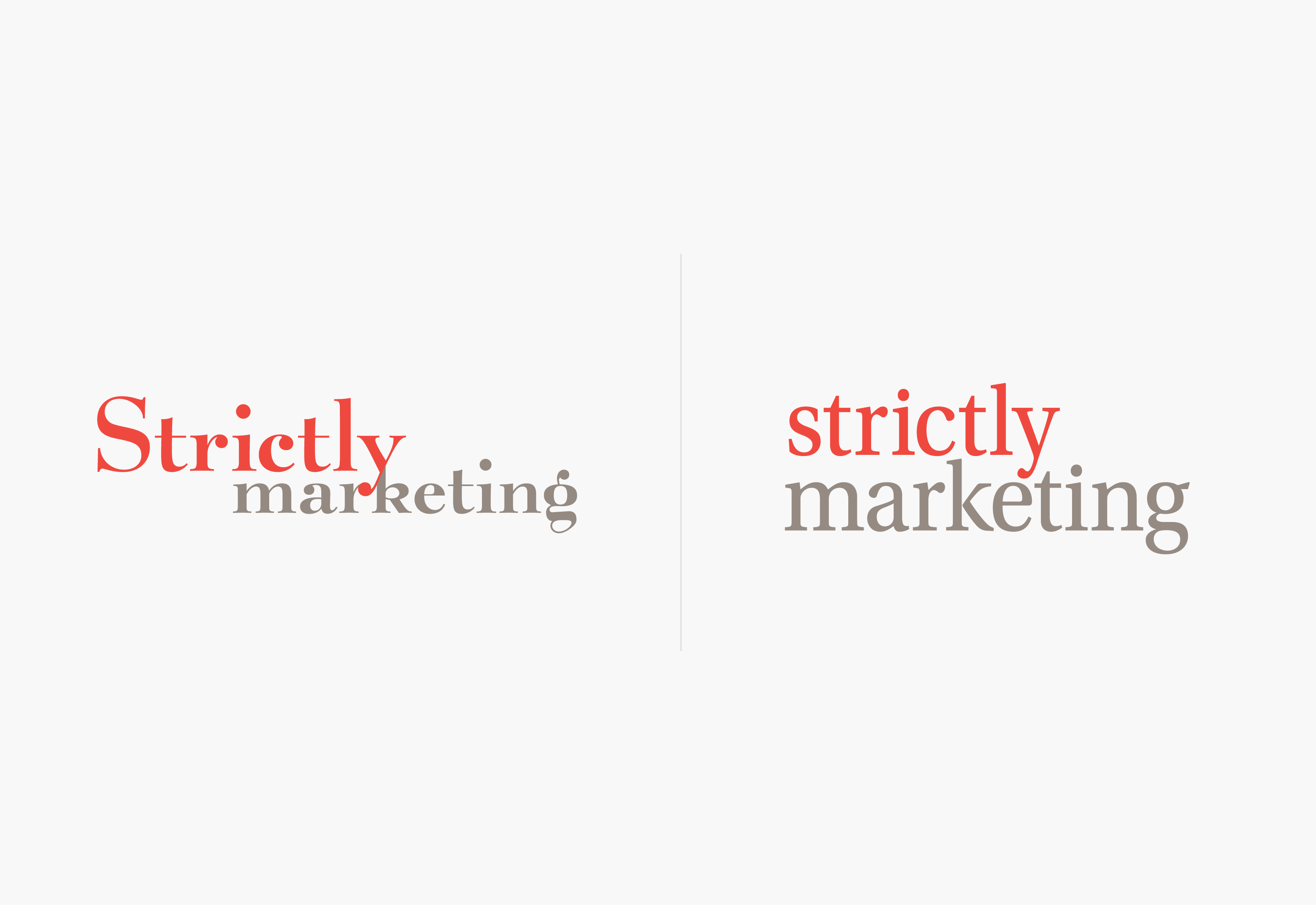
At Strictlymarketing – and leading design and marketing agencies globally – we could not disagree more!
A brand or logo should reflect the business it represents and in order to survive in competitive markets, businesses need to adapt, change and pivot to meet their consumer’s demands and expand their footprint within the market.
Sticking with a tried and trusted brand does have some merit because it is instantly recognisable to the customer base. Great examples globally are Apple and Nike.
But even these mammoths in the retail world understand the need to shift along with the market and have undergone their own logo refresh throughout their histories.

Apple’s original logo from 1976 is a far cry from the logo used today. You can check out the full pictorial history of Apple’s logo here.
Similarly, the Nike logo has undergone its own evolution starting with the now famous white swoosh but with an orange background and the word Nike written in black. Through time this has been scaled down to the simple swoosh.

As marketing specialists, we understand the importance of having the right logo and ensuring it reflects the market and consumer base and a few months ago, embarked on the journey to refresh our own logo.
Strictlymarketing Managing Director, Bev Strickland, explained the logo refresh retains the simplicity and readability of the previous logo but includes a logo icon, as well as portrait and landscape logos to allow for ease of use in any design.
“The current logo was developed for us nearly 20 years ago,” Bev explained. “The look has evolved over time but this is our first deviation from the original logo design.
“The new logo reflects the new era of growth for the business. We have retained the primary colour palette of red and grey and have a fresh secondary colour palette which plays a supporting role for our brand identity to be used to create different moods and two suit different audiences, seasons events and promotional campaigns.
“We have kept the illustrations designed for us as part of our brand refresh in 2014 by award-winning Queensland artist Stella Danalis from Side Gallery, as they have become symbolic of our business and are just so incredible, we don’t want to lose that part of our corporate identity.”
If you want to know more about a logo or brand refresh, get in touch with Strictlymarketing’s Head of Design, Ryan Hayes at rhayes@strictlymarketing.com.au